If you’re going to spend the time and money building your site, you better make you have a home page that converts.
The number one thing that your home page must do for you is convert visitors
Is your home page doing a good job of converting visitors into your mailing list?
I always tell my clients that the money is in the list. And one of the keys to building a bigger list is building a home page that converts. A good home page can and should convert 10-20% of visitors into leads. You should always be building your tribe and your relationship with them and here is no better way than to get them on your list than when they land on your home page.
Did you know that it statistics show that you have a about 3 to 7 seconds to make that critical first impression to your visitors?
Is your home page making the right impression during those critical 3 to 7 seconds?
More than likely visitors will land on your website on either your homepage or your blog (if you are smart about driving loads of traffic to your website). A well designed home page can convert anywhere from 10-20% of your visitors into leads. Here’s an example of how an effective home page can build your list – say you have 50 visitors a day to your site and you convert 5 – 10 of them, over a year you will have increased your list by 1800 to nearly 4000 new subscribers.
If you know your home page isn’t converting & you would like to find out what’s missing – let’s chat! Book time with me right here…
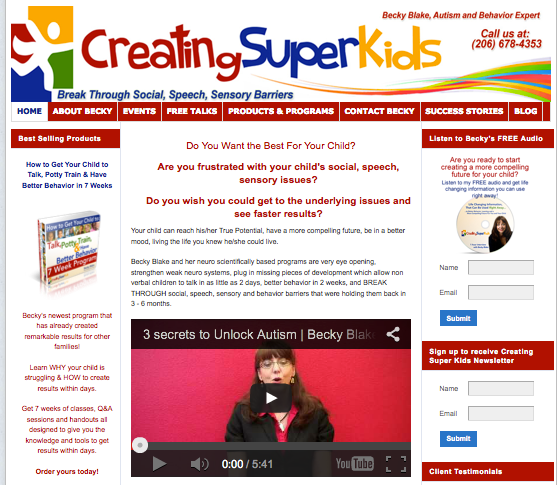
Here are two example sites that I know consistently convert visitors all the time. The first one is a client of mine Becky Blake at Creating Super Kids. She worked with Fabienne Frederickson and followed her coaching when building her website and it has served her well over the years as she has a steady stream of new leads flowing in daily.
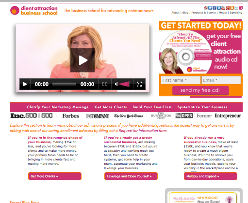
The second example I am going to show you is Fabienne’s at Client Attraction since I want you to see the similarities between the two to drive my point home…
The top 3 things you need to keep in mind
when building a home page that converts:
#1: Keep it simple and resist the urge to add too much
The beauty of the Creating Super Kids and Client Attraction websites is in their simplicity and direct call to action. There isn’t too much copy and as a visitor to both of these sites, the next steps for you are clearly laid out. Becky Blake gives her clients 3 action steps on what they need to do next on her site where to go next. Fabienne asks visitors to determine where they are in their business and then to read more about how she can specifically help them.
Tip #1: Keep copy to a minimum and include bold headlines so visitors can easily scan your page and know what you offer
Tip #2: Keep your side bar free of clutter – you do not need to include every product you sell or waste this space advertising your accreditation’s or associations.
Tip #3: Less is more, keep your paragraphs to a minimum of 2-3 sentences, use headlines and lists when ever possible to make your page easy to scan. Most people when they first visit your site are scanners not readers.
#2: Make use of the space above the fold
What do I mean here? Above the fold which is top 300-500 pixels of your website is the most important real estate on your page. Approximately 90% of your visitors can see this area when landing on your page. Lots of people make the mistake of using too much of this area for their branding, rather than building their mailing list.
Tip #1: Add your opt-in right below your header or at the top right hand of your right side bar like Ann Bennett Marketing does here

Tip #2: Incorporate your opt in into your header like Suzanne Evans does here
#3: Add a video to your home page
Adding a video is another strategy to raise your home page conversion rate.
It’s much easier for people to relate to a video than it is to words filling up a page. A video gives viewers a much better sense of who you are, what you do and why they should work with you.
Tip #1: Place your video where people can see it – above the fold, in the top 600px of your home page.
Tip #2: make sure your content is interesting and that it isn’t too salesy. Focus on telling them who you are, what you do and why they should care. No one wants to be subjected to a sales pitch. In order to generate interest, you need to establish a need and then provide the solution. If your video looks like an infomercial, then your content is not going to convert visitors into customers.
Tip #3: Keep it short and don’t try to explain too much or you will lose their interest. Keep it around 3 minutes.
Tip #4: Make sure your video loads quickly – 4 out of 5 people will leave a video if it pauses to buffer.
Tip #5: Don’t wait until the end for your call to action. You not only need to make your content interesting, informative and up-to-date, you also need to make your next step explicitly visible right from the start!
Tip #6: Infuse your video with your personality. What you say in your video is just as important as how you say it. Don’t sound like that boring monotone science teacher you had back in Junior High and put your audience to sleep!
Tip #7: Remember to keep your video up to date. I suggest that you change your video at least 1 to 2 times a year to keep your home page fresh.
Remember the money is in your list and putting your website to work the right way can help you generate more leads. Start with your home page and employ a few of these tactics I’ve outlined here. Don’t forget to measure your results and keep tweeking. Even the most experienced of online marketers continually measure and tweak their content. Get all of the information on building your list on this handy resource page I’ve created: How to build an email list.
About Kristen Poborsky
 Kristen and her team are experts at helping you generate more leads so you can turn them into clients. She has developed a 3-step process that helps clients build their lists by generating more website traffic and opt-ins.
Want to talk to Kristen about getting more traffic, leads & clients using this an other strategies from my tool box? Book time with her right here…
Be sure to take the website quiz! You’ll find out what you might be missing and get a copy of her FR*EE report: The Essential Guide to Making Money With Your Website.
Here’s to more leads, more clients & more money!
