I want you to think of your website’s home page’s primary job is to conduct an interview for you.
Every time someone visits your home page they are doing the following.
Critiquing what your site looks like.
Critiquing your copy.
Establishing an opinion of whether or not you can help them solve their most pressing problem(s).
Deciding if you are worth getting to know further by either consuming your content or joining your list.
And most importantly, if you are worth doing business with.
Do you think your homepage is making the right impression during this interview of sorts?
In this article, I share the 11 crucial elements your home page should have if you want it to help you conquer that interview and help build your coaching practice.
- Quickly and clearly tells visitors how you can help them.
- Video introduction.
- How to contact you.
- A well-thought-out customer journey.
- An overview of who you are.
- An overview of your services.
- Client testimonials.
- Great design including high-quality images.
- Most recent blog posts.
- A clear call to action.
- Social media links.
Let’s dive deeper into each of these 11 elements deeper so you can use them to spiff up your home page.
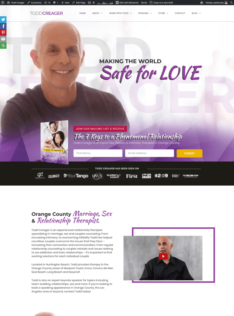
Element #1: Your home page needs to quickly and clearly tells your visitors how you can help them.
You only have a few seconds to make that first impression. Just like you want to make that good impression face to face, you have to do the same on your website.
Three key things on your website will help do this for you
Your header image and copy.
- Your introductory title.
- Your introductory paragraph.
- Video introduction
Each of these must clearly let your visitors know that they are in the right place and you are the right person to help them solve the problem they are struggling with.
Here’s an example of a highly successful multiple 6-figure relationship coach’s first impression on a website:
Element #2: Video Introduction
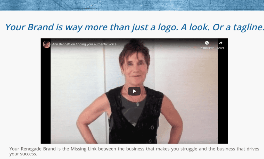
This element helps you with #1 and builds a connection with your visitors. You want to include a quick introductory video that explains quickly who you are, your philosophy, and how you can help.
This gives visitors more of a connection with you and a better understanding of your personality. People buy based more upon emotions rather than logic. So if you can build a sense of connection and rapport they will be more likely to stay on your site and move to the next step in your customer journey.
Here’s an example of a video from a branding coach’s website we designed for her:
Element #3: How to contact you
How many times have you been in need of tech support or customer service, but couldn’t get someone on the phone to save your life?
Don’t put your prospects in the same position.
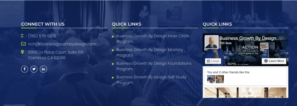
Visitors should be able to find your contact information easily on your homepage. Most commonly found in the footer (like in the example from our website above), your homepage should include a mailing address, email address, and phone number in case someone is interested in reaching you.
People want to work with people. Having this information readily available offers comfort by letting people know they can get a hold of someone if need be and also adds credibility, making it clear that this is the homepage of a legitimate business.
Here’s an example where we have included contact information on a homepage of a business coach’s website:
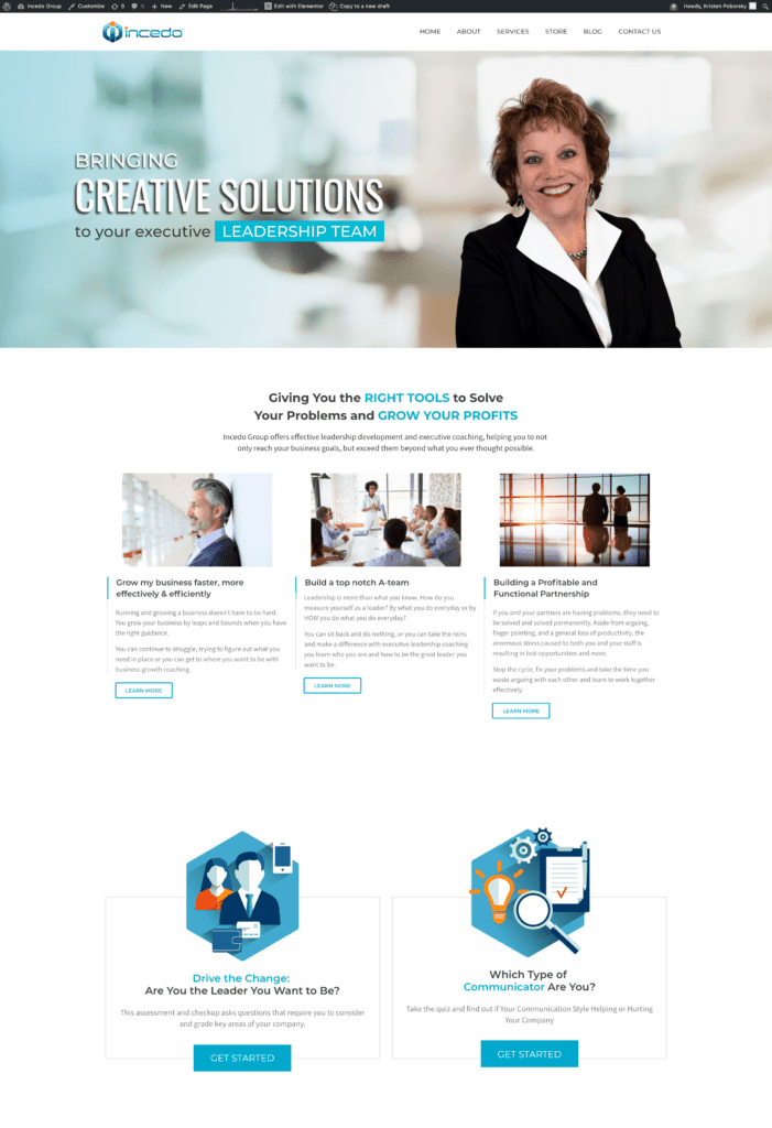
Element #4: A well-thought-out customer journey.
You want someone to arrive on your website and know exactly what to do next and/or where they can find the information they want and need quickly and without being confused.
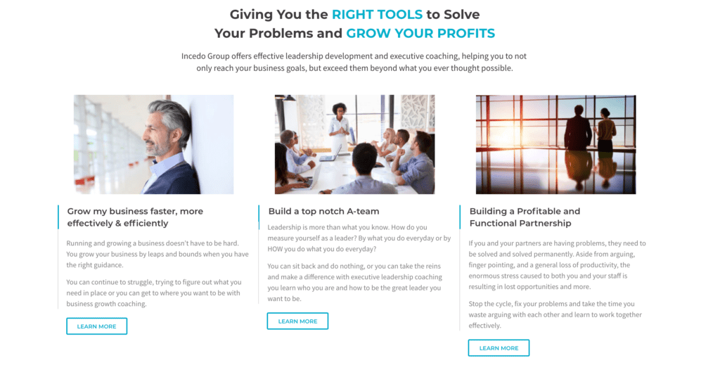
Your customer journey should also reflect your customer’s typical behavior highlighting their problem and then bringing the pages they should visit as their next logical step.
For example, if you are a business coach and you work with 3 types of clients, you should highlight each type of client, their typical problems, and then where they should go next to get more information on how to solve it.
The next step can be a service or product page or even a piece of content. The rule of thumb is that on every page you take them to there should be the next logical steps.
The goal of your customer journey should be to bring them closer to making a buying decision, to get them on your list, or to pick up the phone (or email) you to get into a conversation.
Here’s an example of three options for a customer journey experience from https://incedogroup.com website:
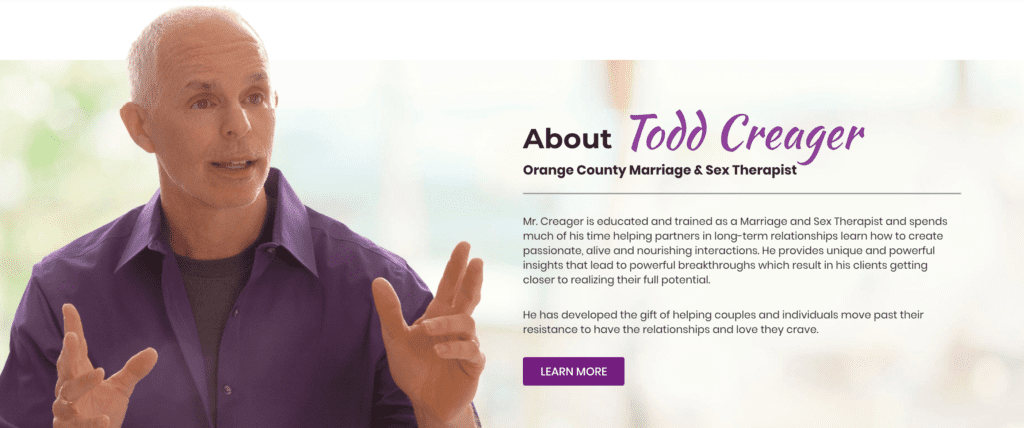
Element #5: An overview of who you are.
Having a short paragraph about who you are and the benefit of working with you compliments what you have in your header image, your intro paragraphs and your video. Ideally, the content on each of these sections should all say pretty much the same thing.
Doing this will reinforce your message and let them know that they are in the right place. Include a button or link that will take them to your about page.
Here’s an example of a great about paragraph:
Element #6: An overview of your services and or products
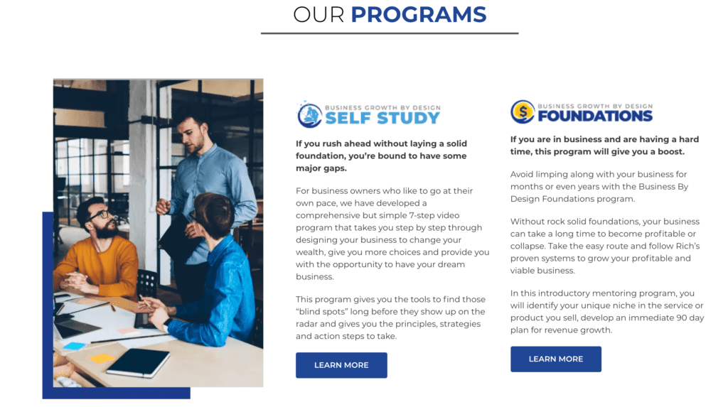
While your introduction section gives people an idea of what you do and how you can help them, having a services section where they can see what kind of services or products you sell helps them take the next logical step from your home page to another area on your site.
Ideally, you want to make each of these simple a very short paragraph in a button to go and learn more.
Here’s an example of a product section:
Element #7: Include a maximum of 3-5 client testimonials.
According to Spiegel Research Center, displaying reviews on your homepage and elsewhere on your site can increase conversion rates by 270%.
Visitors to your site consider these to be social proof that you are good at what you do. However, you don’t need to go overboard and have a lot of reviews/ testimonials.
Spiegel Research Center says that having more reviews isn’t better. They say that the benefit of additional reviews begins diminishing rapidly after the first five reviews.
As a rule of thumb, we tell our clients to give us 3-5 testimonials for a home page when working on a project together.
Here’s a very simple testimonial example:

Element #8: Great design including high-quality images.
A poorly designed page or one that looks like it was built ages ago won’t do anything for your image. Remember when I said that your homepage is conducting an interview for you?
Just like you wouldn’t go to an interview wearing a 10-year-old suit, or in ratty or torn jeans, you shouldn’t have an out-of-date home page or one that doesn’t look polished and professional.
That goes for images on your home page. Stock images are okay, ideally, you want to have high-quality images of yourself on your home page.
Using real photos of you, (your team if you have one) and your office on your homepage shares a behind-the-scenes picture of what people can expect when working with you and further builds rapport.
Having great headshots, images, and graphics greatly enhance your home page as you can see in this example:
Element #9: Most recent blog posts.
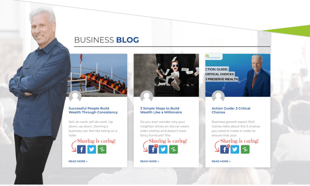
I’m passionate about creating content because I know when done right, it helps my coaching clients to fill their practices. That being said, when we design a home page for our clients I always recommend that they have the three most recent blog posts highlighted on their homepage.
Doing this gets people over to your content and consuming it.
Your content great way to showcase your expertise and to get your visitors on your website to know you better and excited about working with you.
Here’s an example:
Element #10: A clear call to action.
People visit your homepage (and any other page on your site) it should be clear what action you want them to take next.
This is key to your well-thought-out customer journey that we covered in Element #4. Think of your home page as a way to get your visitors to quickly decide if they are in the right place and then to take the next step that is right for them.
On your homepage, these calls to actions generally are:
- Going to the next page on your site for more information
- Consuming your content on your blog page
- Subscribing to get a lead magnet or newsletter
- Requesting a consultation either via phone or by email.
Sit down and decide on what one or two actions you really want people to take when land on your homepage. We generally suggest to our clients that they put contact information in a couple of highly visible places and then focus on getting the visitor to take action by going to other pages on their sites.
Having more than 1-2 options will only confuse your visitor and clutter your buyer’s journey.
Element #11: Social media links.
You want people to check you out, then follow and engage with your company on your social media platforms.
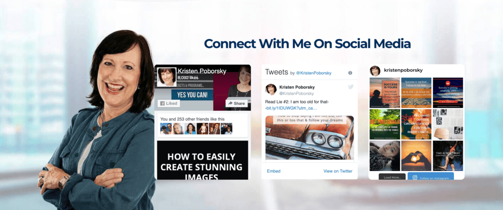
Include your social media links in a consistent place on your site where your visitors will naturally find them. We like to put them along with social media feeds in our client’s footers along with contact information
Just like this example below:
Wrapping up, here are the 11 crucial elements your home page needs to conquer that first interview and help build your coaching practice.
- Quickly and clearly tells visitors how you can help them.
- Video introduction.
- How to contact you.
- A well-thought-out customer journey.
- An overview of who you are.
- An overview of your services.
- Client testimonials.
- Great design including high-quality images.
- Most recent blog posts.
- A clear call to action.
- Social media links.
