If you’re not already using images for all of your content, here’s some statistics to convince you why it’s important.
Statistic #1: Content with images get 94% more views. Why? Because images on social media platforms and on blogs are usually the first thing that catches people’s attention.
Statistic #2: When people hear information, they’re likely to remember only 10% of that information three days later. However, if a relevant image is paired with that same information, people retained 65% of the information three days later. – Hubspot
Statistic #3: Social media content with images is more sharable, and it’s a smart practice to use the image you used when creating your content. According to studies, Facebook posts with images get 87% more engagement, and tweets with images get 18% more clicks, 89% more favorites and 150% more retweets) – Hubspot
So do I have you convinced about the power of images and why you should use them when creating content that you want to be profitable for your business?
I’ve pulled together a list of 6 strategic images and how to use them in your content.
These images will increase your readership and engagement with your content.
Include Images that give your content personality.
Images are the perfect opportunity to strengthen your brand “voice”. So consider your brand carefully when selecting an image for your content.
Does it align with the over all look and feel for your business? Do you have a theme or general type of image that you know will resonate with your audience or that they will quickly identify with your brand?
Narrowing in on the type of image and having guide lines for what types of images you select will help you strengthen your brand image.
Use images to help break up longer content.
When creating a resource page, a power page or any type of content that is over 2000+ words it is smart to include images throughout your content.
Used strategically to break up your content into smaller easier chunks serves to help break up the text, making your content easier to scan.
Select high contrast colorful images for your content.
This will help you stand out in and increase your engagement. A great idea is to try to incorporate your brand colors in your images where possible, both helping you to stand out and strengthen brand awareness.
Incorporate both fun and informative images.
If you use statistics, understand that your readers love graphs, charts, infographics.
Use images strategically to make your data visually interesting whenever you can in your content.
Use unexpected images to convey meaning.
Instead of using typical stock images for your content, stand out by picking images that convey the meaning instead of using standard stock images.
A good example is if you are a business coach creating content about communication where no one is listening.
You might expect to see an image set in an office with people chatting.
A not-so-obvious choice might be to pick a photo of someone on a mountain top shouting out into the distance with no one listening.
Incorporate Screenshots into your content to illustrate your stories.
Use screenshot images strategically when sharing success stories, testimonials, and case studies to strengthen your content.
Think of them as a visual aid/proof for whatever you are sharing. Screenshots can help position you as an expert in your niche.
You can also use screenshots to illustrate steps of a process when creating how-to content.
The images you use in your content across all platforms help tell a story as much as your words do.
It’s important not only to include images but also to include the right images to help you get your story across visually.
Images should be an integral part of every piece of content you create whether it is a written post, a video, or any form of content.
Instead of thinking about your images as an afterthought, something that you rush to choose after creating your content … think of your images the same way you think of your content’s introduction, close, or title: You need to put careful thought into each one.
Images support your words and hold your argument together.
If you follow these suggestions for selecting images for your content, you’ll find that your content creates a stunning reading experience for your visitors and is more visually appealing and engaging.
I’m all about adding the right images to your content. I believe that images are equally as important as having a strong headline. The image that I chose for my post here is a good illustration of an attention-getting image + title intended to draw viewers to my post on social media.
Founder (0ne of my personal heroes) and CEO Neil Patel of Quicksprout conducted a study of 41 blogs across several different industries and the findings pointed out that when custom graphics and images are added to the content, it gets a significantly higher amount of social shares than content with stock photos, screenshots and royalty-free images. In some cases, these images get up to 10times more shares.
Here’s a recap of the Quicksprout study:
- Stock photo images on content get an average of 235 shares
- Screenshots tend to get about an average of 165 shares
- Royalty-free images averaged about 72 shares
- Info-stats and infographics get an average of 538 shares
- Hand-drawn images average 807 shares on social media- whoa!
After looking at those stats are you still confused about what types of images you should be using on your blog posts?
When it comes to putting your content out on social media, content with the right images makes all the difference if you want to stand out from the crowd.
Without a doubt, your first blog image should be at the very top of your post and centered. Enough said… Let’s dive into the top 6 images that you should be using for your blog posts
1. Screen Shots
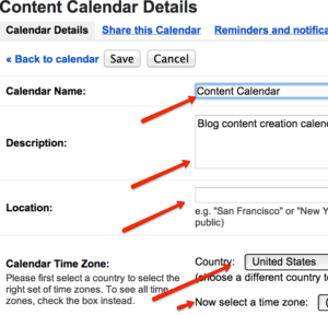
When you are teaching something in your blog post then screenshots illustrating the step are the way to go. They make it easier to get your point across and easily illustrate what you are trying to teach.
One of my favorite tools to create great looking screen shots where I can add in arrows and text is Jing by Techsmith at: http://www.techsmith.com/jing.html
2. Graphs and Charts
When making a point or a case study, statistics really help to provide social proof. Using graphs and charts illustrate your research in a way that makes them stand out and the reader is more likely to be influenced by your content.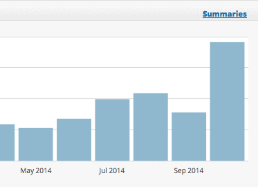
Recently I was working with a prospective client and I wanted to show him how doing the right content marketing could drastically improve his web traffic. I illustrated my point by sending him the above graph from a client’s website that illustrated how his web traffic had gone from 1055 hits in May to 2000 in July and then doubled to 4000 in October by redoing his website and following my content marketing system.
3. Infographics
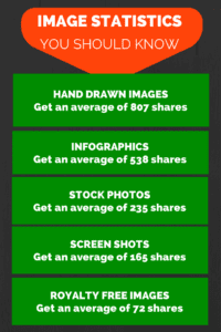
Here’s a simple infographic created with Canva.
According to the Quick Sprout Study, infographics get an average of 538 shares. When was the last time you added an infographic to a page or post on your website? I know they have been all the rage and for a while everyone was doing them and now I am not seeing them as much.
That being said, it looks like infographics are not dead! I suggest that you add some next time you do a blog post. Here is a great resource for infographics:
https://www.canva.com: Super simple to use and they have templates built to help you get started creating infographics.
4. Stock photos
I believe that every post and page on your site should have photos to break up the text and grab the attention of the reader. The image you use should be relevant to the content you are sharing and be eye-catching.
Be picky if you go the route of royalty-free images, these often are of lower quality and run the risk of looking amateurish if you use crummy-looking photos.
Here are my picks for great places to get photos
- http://photodune.net/ : love this one for $1 photos, this is a go to resource for me!
- http://www.istockphoto.com/: a bit more expensive than photo dune and my next choice when I can’t find what I want there.
- http://www.veer.com/ : another great resource for photos, fonts and illustrations!
Tip – Try using a stock image and adding copy to it on a blog post like the one I have created for this post. This is a great way to get more attention on social media.
5. Animated images
LOL! Who thought that a funny animated image like the silly frog above, graphics, or animated infographics, could generate the highest number of social shares of all the image types in this post?
The main issue with using animated graphics is that they are much more difficult to generate than any other image type.
Not very many blogs use animated graphics, but those that do find that such posts perform extremely well. On average, animated graphics generated 551 tweets and 680 Facebook likes.
Here are some resources for animated graphics like the example above
- http://www.fg-a.com/animals.htm
- http://www.animationlibrary.com/
- http://www.gifanimations.com/
6. Hand Drawn images
Image courtesy of Daniel Ferencak
Why do you think cartoon characters like Bugs Bunny and Sponge Bob Square Pants are so popular? Because they tickle our sense of humor and are entertaining.
You’ve seen those hand-drawn arrows and fonts that look hand drawn. Yes, they catch your eye and these images are one of the more difficult image types to create yourself because need to have good illustration skills. Hand-drawn images get shared much more frequently on social media.
Did you know that hand-drawn images get 318 tweets and 489 Facebook likes? What was interesting about the data is that it seems Facebook prefers hand-drawn images more than Twitter does.
You can find hand-drawn images on the same sites I mention for stock images:
- http://photodune.net/ : love this one for $1 photos, this is a go to resource for me!
- http://www.istockphoto.com/: a bit more expensive than photo dune and my next choice when I can’t find what I want there.
- http://www.veer.com/ : another great resource for photos
So there you have it – the list of the top 6 images that you should be using for your blog posts and why you should be using at least one of them on each of your posts or content pages on your site.
I’d love to know which of these images you are currently using and what are you going to try?
Want to sell more services & products on autopilot?

FREE Download: I’ll show you step by step the 7 simple changes you can make to your website that will have it making money while you are sleeping!
Get the Profitable Content Creator’s Roadmap
- This roadmap will walk you through the first steps towards creating your own profitable content.
- You’ll get the 5 steps that show you how to create content so that you can start using them to create content that transforms instead of informs.
- The 3 mistakes you might be making with your content so you can start creating content that leads prospects to work with you.


